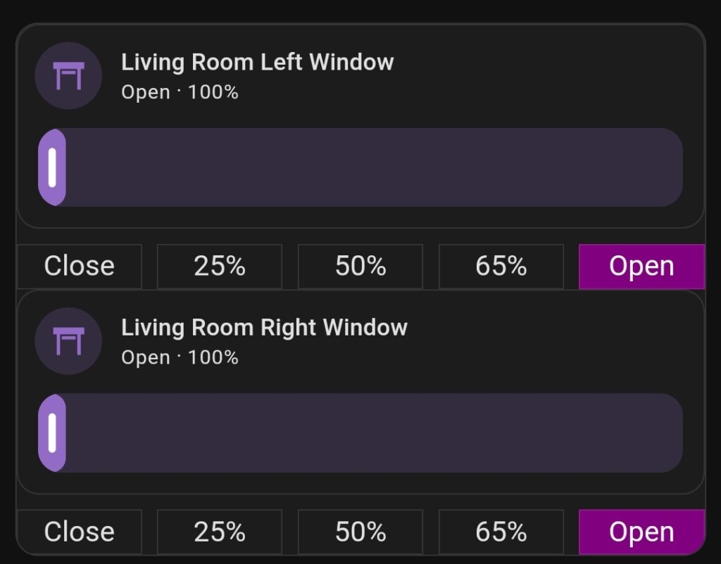
Form my window Roller Shutters I wanted to have possibility of manual Up & Down control, Slider control and Preset Buttons. I also wanted to have both Roller Shutters in same section, without any shadow or spacer in between.
I searched forums and FB Groups and I found some pieces of code hare and there but nothing worked as I wanted to.
I then found custom:vertical-stack-in-card and everything changed.
To achieve what you see on the pictures I used:
- custom:vertical-stack-in-card
https://github.com/ofekashery/vertical-stack-in-card - custom:button-card
https://github.com/custom-cards/button-card - tile card
https://www.home-assistant.io/dashboards/tile/
The code for everything is:
type: custom:vertical-stack-in-card
cards:
  - type: vertical-stack
    cards:
      - features:
          - type: cover-position
        type: tile
        entity: cover.living_room_shutter_3
        name: Living Room Left Window
      - type: horizontal-stack
        cards:
          - type: custom:button-card
            tap_action:
              action: call-service
              service: cover.set_cover_position
              service_data:
                position: 0
                entity_id: cover.living_room_shutter_3
            entity: cover.living_room_shutter_3
            name: Close
            show_icon: false
            card_mod:
              style: |
                ha-card {
                  --ha-card-background:
                  {% if is_state_attr('cover.living_room_shutter_3', 'current_position', 0) %}
                    purple;
                    color: white;
                  {% endif %}
                }
            styles:
              card:
                - border: 0px 0px 0px 0px
                - border-radius: 0%
                - box-shadow: 0px 0px 0px 0px
          - type: custom:button-card
            tap_action:
              action: call-service
              service: cover.set_cover_position
              service_data:
                position: 25
                entity_id: cover.living_room_shutter_3
            entity: cover.living_room_shutter_3
            name: 25%
            show_icon: false
            card_mod:
              style: |
                ha-card {
                  --ha-card-background:
                  {% if is_state_attr('cover.living_room_shutter_3', 'current_position', 25) %}
                    purple;
                    color: white;
                  {% endif %}
                }
            styles:
              card:
                - border: 0px 0px 0px 0px
                - border-radius: 0%
                - box-shadow: 0px 0px 0px 0px
          - type: custom:button-card
            tap_action:
              action: call-service
              service: cover.set_cover_position
              service_data:
                position: 50
                entity_id: cover.living_room_shutter_3
            entity: cover.living_room_shutter_3
            name: 50%
            show_icon: false
            card_mod:
              style: |
                ha-card {
                  --ha-card-background:
                  {% if is_state_attr('cover.living_room_shutter_3', 'current_position', 50) %}
                    purple;
                    color: white;
                  {% endif %}
                }
            styles:
              card:
                - border: 0px 0px 0px 0px
                - border-radius: 0%
                - box-shadow: 0px 0px 0px 0px
          - type: custom:button-card
            tap_action:
              action: call-service
              service: cover.set_cover_position
              service_data:
                position: 65
                entity_id: cover.living_room_shutter_3
            entity: cover.living_room_shutter_3
            name: 65%
            show_icon: false
            card_mod:
              style: |
                ha-card {
                  --ha-card-background:
                  {% if is_state_attr('cover.living_room_shutter_3', 'current_position', 75) %}
                    purple;
                    color: white;
                  {% endif %}
                }
            styles:
              card:
                - border: 0px 0px 0px 0px
                - border-radius: 0%
                - box-shadow: 0px 0px 0px 0px
          - type: custom:button-card
            tap_action:
              action: call-service
              service: cover.set_cover_position
              service_data:
                position: 100
                entity_id: cover.living_room_shutter_3
            entity: cover.living_room_shutter_3
            name: Open
            show_icon: false
            card_mod:
              style: |
                ha-card {
                  --ha-card-background:
                  {% if is_state_attr('cover.living_room_shutter_3', 'current_position', 100) %}
                    purple;
                    color: white;
                  {% endif %}
                }
            styles:
              card:
                - border: 0px 0px 0px 0px
                - border-radius: 0%
                - box-shadow: 0px 0px 0px 0px
  - type: vertical-stack
    cards:
      - features:
          - type: cover-position
        type: tile
        entity: cover.living_room_shutter_4
        name: Living Room Right Window
      - type: horizontal-stack
        cards:
          - type: custom:button-card
            tap_action:
              action: call-service
              service: cover.set_cover_position
              service_data:
                position: 0
                entity_id: cover.living_room_shutter_4
            entity: cover.living_room_shutter_4
            name: Close
            show_icon: false
            card_mod:
              style: |
                ha-card {
                  --ha-card-background:
                  {% if is_state_attr('cover.living_room_shutter_4', 'current_position', 0) %}
                    purple;
                    color: white;
                  {% endif %}
                }
            styles:
              card:
                - border: 0px 0px 0px 0px
                - border-radius: 0%
                - box-shadow: 0px 0px 0px 0px
          - type: custom:button-card
            tap_action:
              action: call-service
              service: cover.set_cover_position
              service_data:
                position: 25
                entity_id: cover.living_room_shutter_4
            entity: cover.living_room_shutter_4
            name: 25%
            show_icon: false
            card_mod:
              style: |
                ha-card {
                  --ha-card-background:
                  {% if is_state_attr('cover.living_room_shutter_4', 'current_position', 25) %}
                    purple;
                    color: white;
                  {% endif %}
                }
            styles:
              card:
                - border: 0px 0px 0px 0px
                - border-radius: 0%
                - box-shadow: 0px 0px 0px 0px
          - type: custom:button-card
            tap_action:
              action: call-service
              service: cover.set_cover_position
              service_data:
                position: 50
                entity_id: cover.living_room_shutter_4
            entity: cover.living_room_shutter_4
            name: 50%
            show_icon: false
            card_mod:
              style: |
                ha-card {
                  --ha-card-background:
                  {% if is_state_attr('cover.living_room_shutter_4', 'current_position', 50) %}
                    purple;
                    color: white;
                  {% endif %}
                }
            styles:
              card:
                - border: 0px 0px 0px 0px
                - border-radius: 0%
                - box-shadow: 0px 0px 0px 0px
          - type: custom:button-card
            tap_action:
              action: call-service
              service: cover.set_cover_position
              service_data:
                position: 65
                entity_id: cover.living_room_shutter_4
            entity: cover.living_room_shutter_4
            name: 65%
            show_icon: false
            card_mod:
              style: |
                ha-card {
                  --ha-card-background:
                  {% if is_state_attr('cover.living_room_shutter_4', 'current_position', 75) %}
                    purple;
                    color: white;
                  {% endif %}
                }
            styles:
              card:
                - border: 0px 0px 0px 0px
                - border-radius: 0%
                - box-shadow: 0px 0px 0px 0px
          - type: custom:button-card
            tap_action:
              action: call-service
              service: cover.set_cover_position
              service_data:
                position: 100
                entity_id: cover.living_room_shutter_4
            entity: cover.living_room_shutter_4
            name: Open
            show_icon: false
            card_mod:
              style: |
                ha-card {
                  --ha-card-background:
                  {% if is_state_attr('cover.living_room_shutter_4', 'current_position', 100) %}
                    purple;
                    color: white;
                  {% endif %}
                }
            styles:
              card:
                - border: 0px 0px 0px 0px
                - border-radius: 0%
                - box-shadow: 0px 0px 0px 0px
Below is a Light Mode screenshot from my phone.

Hi Martin
Nice job and many thanks for sharing your code 🙂
I have create a similar card who works very well, but unfortunately one thing didn’t work.
The background color will not change by state attribute to green!
No error message occurs but the color will also not change 🙁
Any idea?
Since I’m using it to control venetian blinds, the next challenge is to add a blind position slider 🙂
thanks
reards
Kei
Hi.
Please, contact me on messenger.
Hello,
The background color will not change by state attribute to green!
Hello.
I changed this card to Tiles. Se the updated post.